In my last post I revealed the new formal living room and sun room from my English Village project. Today, I am revealing the master bedroom! This room is HUGE! Which sounds great and it is in many ways, but it can also create some design challenges. There were so many big spaces and empty corners to fill and our goal was to fill them without making the space look cluttered and over done.
I'm really happy with how it all came together and how we balanced the layout without adding too much. It's also worth noting that even though the before and after is dramatic we really only added a few new furniture pieces. We kept the same bed and the bedside tables. The chairs in the seating area were previously downstairs in the living room so we didn't even have to buy those. We mainly relied on lots of good accessories (vintage moroccan rug, sconces, new drapes, beautiful bedding, and white oak bench) to add pattern and texture and really transform this space.
Here we go:
Before... A little dark and heavy
After....Same bed. Same bedside tables. We lightened things up by getting rid of the heavy lamps and the large, dark recliner that was in the corner. Adding the moroccan rug really lightens up the floor and brings in a fun pattern. And obviously, beautiful bedding makes a big difference!
Sources: Leather chair: Barnaby Lane / Rug: Drift Home Collection / Lumbar Pillow: My Haven Home / Bench: Rejuvenation
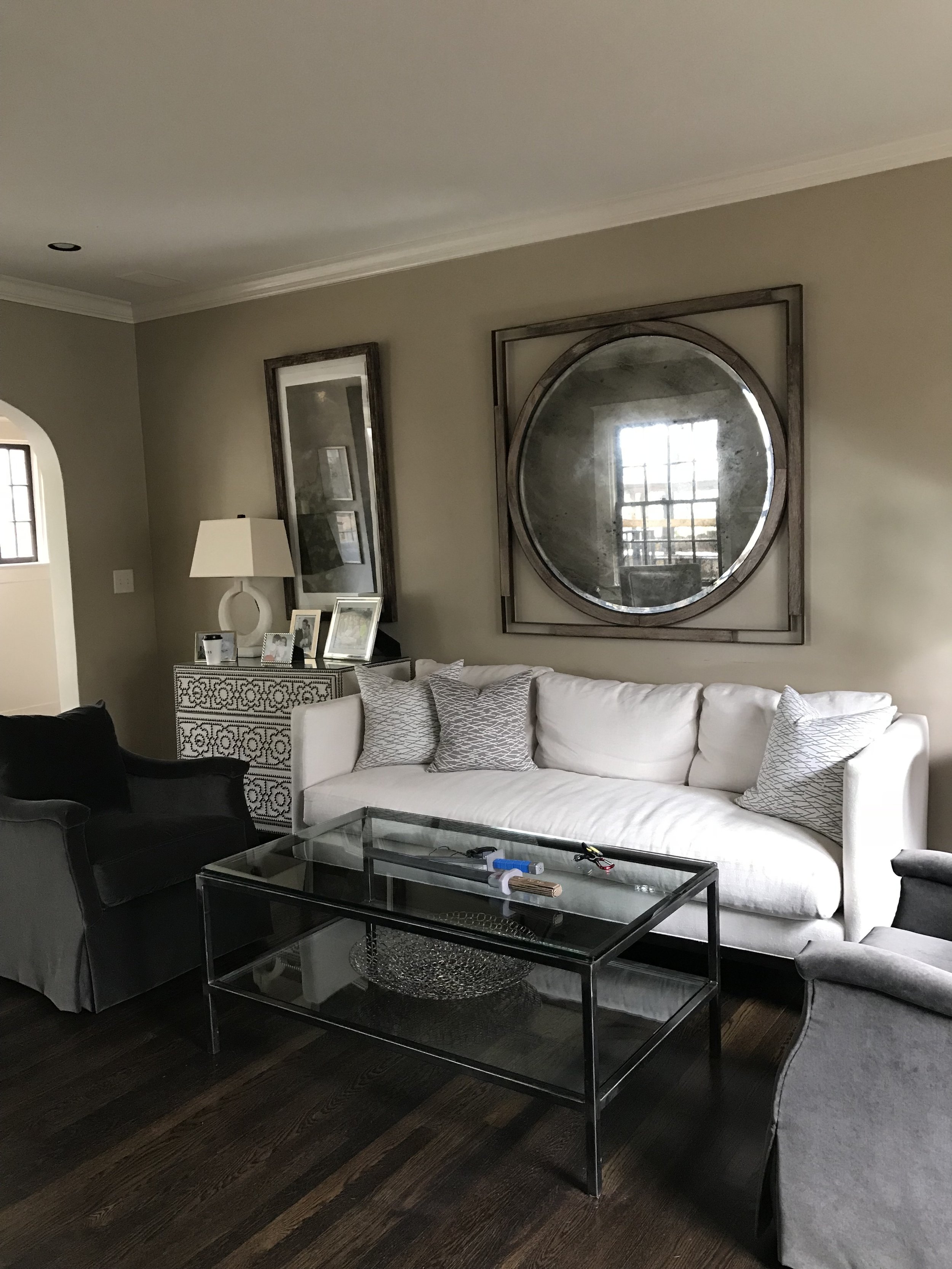
Before......in my clients defense her husband is the one with the clothes hoarding/piling problem :) So we stole his giant recliner and sofa so he could no longer pile. Kidding. Sort of. We actually moved that sofa down to the sunroom and it fit perfectly in front of the sunroom window. And we moved his recliner to his man cave.
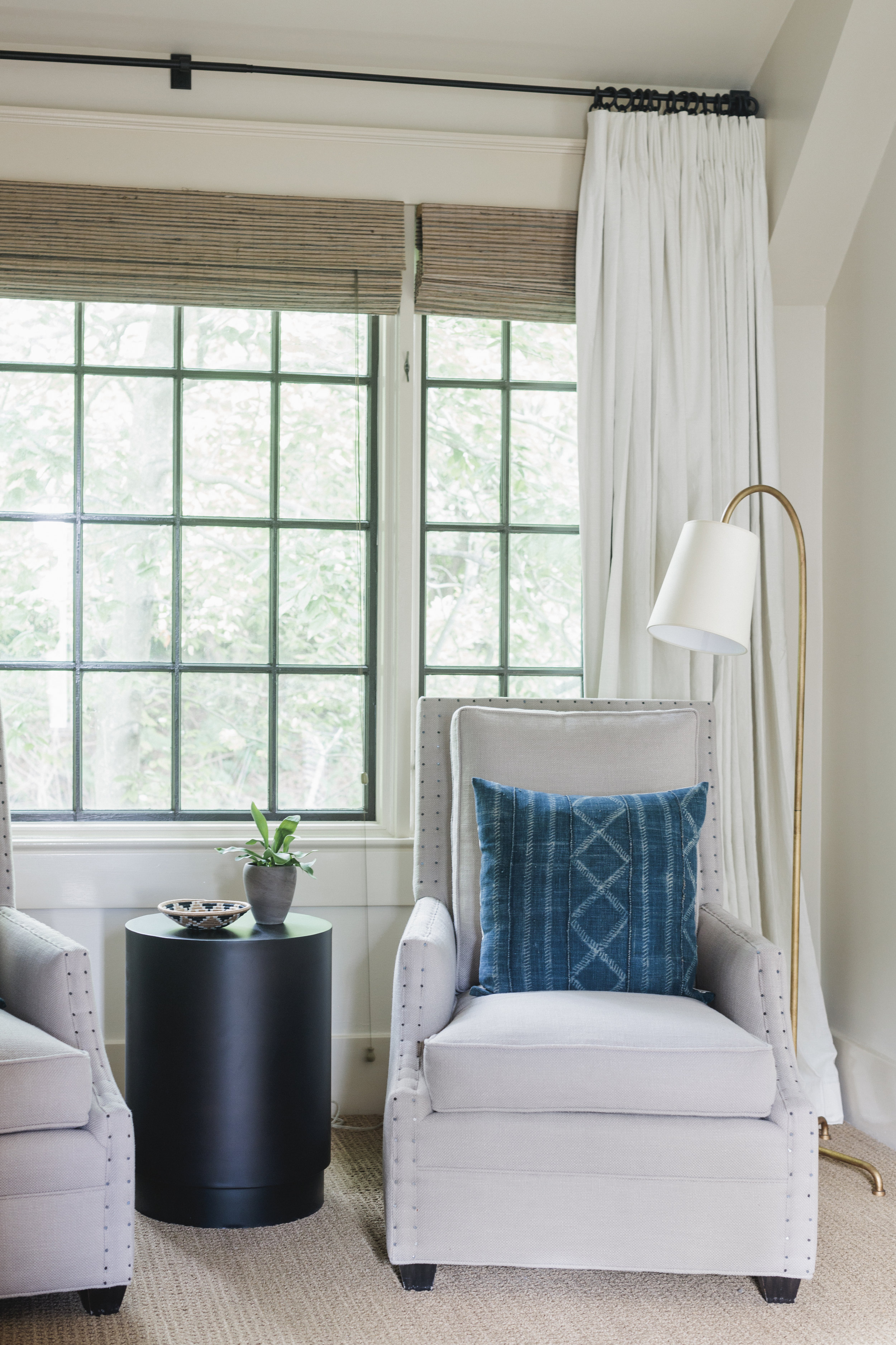
After.....As I mentioned, we brought these chairs up from the living room and I really like how they create seating without blocking the window like the sofa did previously. We replaced those very heavy iron floor lamps with a more delicate brass lamp. We kept the bamboo shades because they add great texture, but we also added a beautiful ivory linen drape to soften the room and to frame the seating area. And a little pop of indigo is always a good thing!
Sources: Drapes: Loom Decor / Pillows: My Haven Home / Side Table: Crate & Barrel
Before....this area was begging for something. We went back and forth on whether to add shelving, a large mirror, a great piece of art.......so many options.
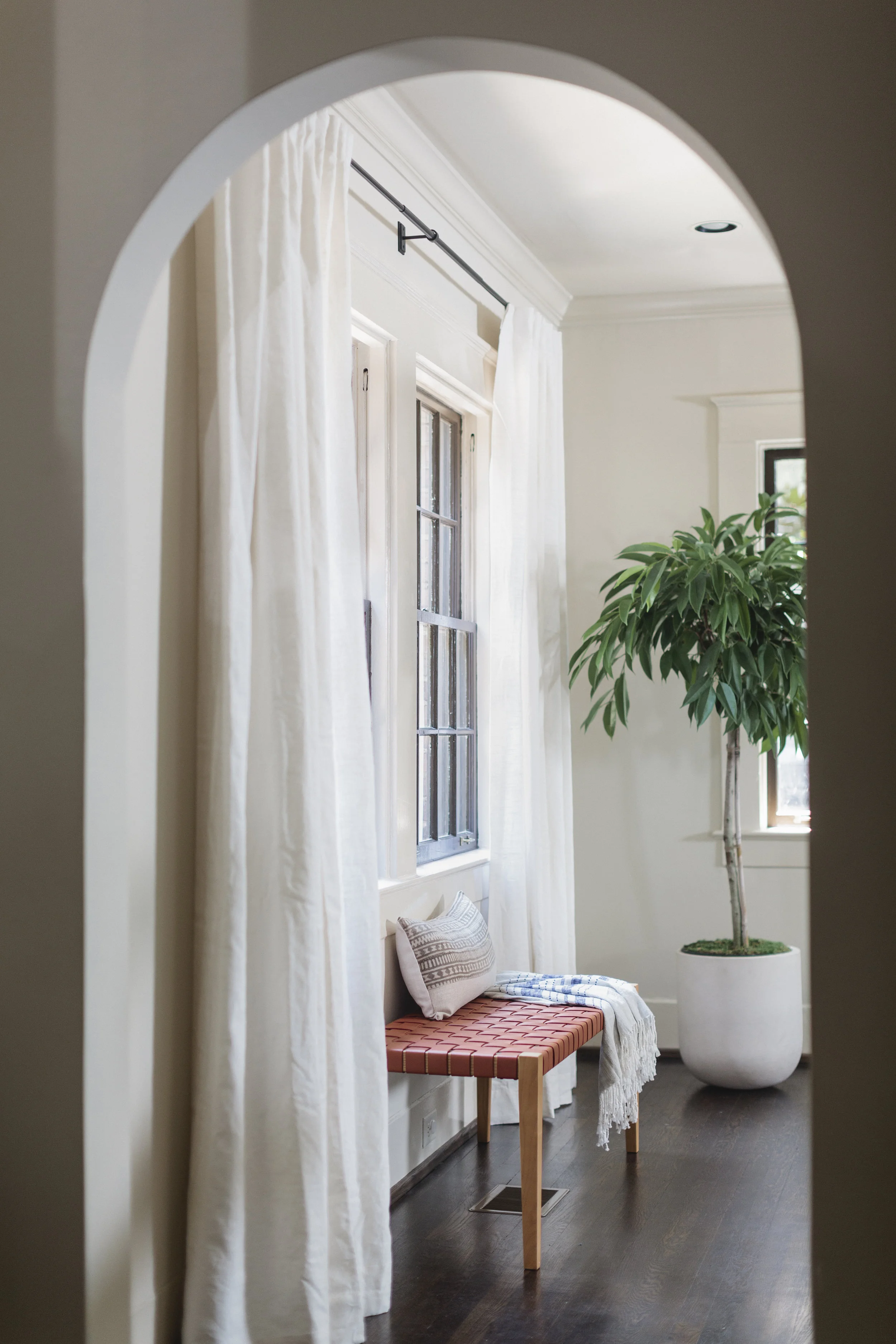
After......While we were sourcing chairs for the living room we came across this great woven leather chair from Barnaby and we knew it would be perfect next to that window. We added the ladder for height and visual interest. The walnut wall hooks were a last minute find from an artisan in Slovenia. I begged him to rush them to me which he very nicely did.
Sources: Ladder: Crate & Barrel / Turkish Towel: Burkleman / Walnut Hooks: Raw Originals
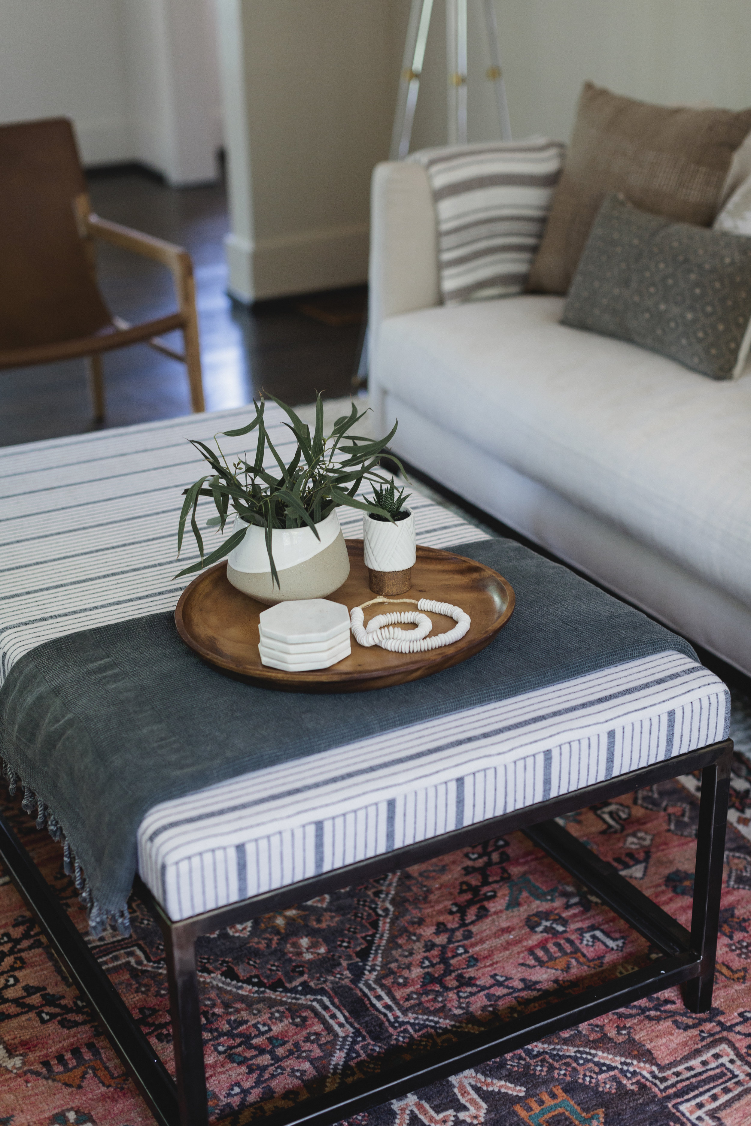
A few more photos of the details.....
I love this linocut art. I found it on Etsy.
Sources: African woven bowl: Local and Lejos
Interior Design: ADID Studio
Photography credit: Graham Yelton
