I finally got the professional photos back of my house and I am so excited to share with you guys! There are a lot of pictures so I'm going to divide the spaces up into separate posts. We'll start with the kitchen.
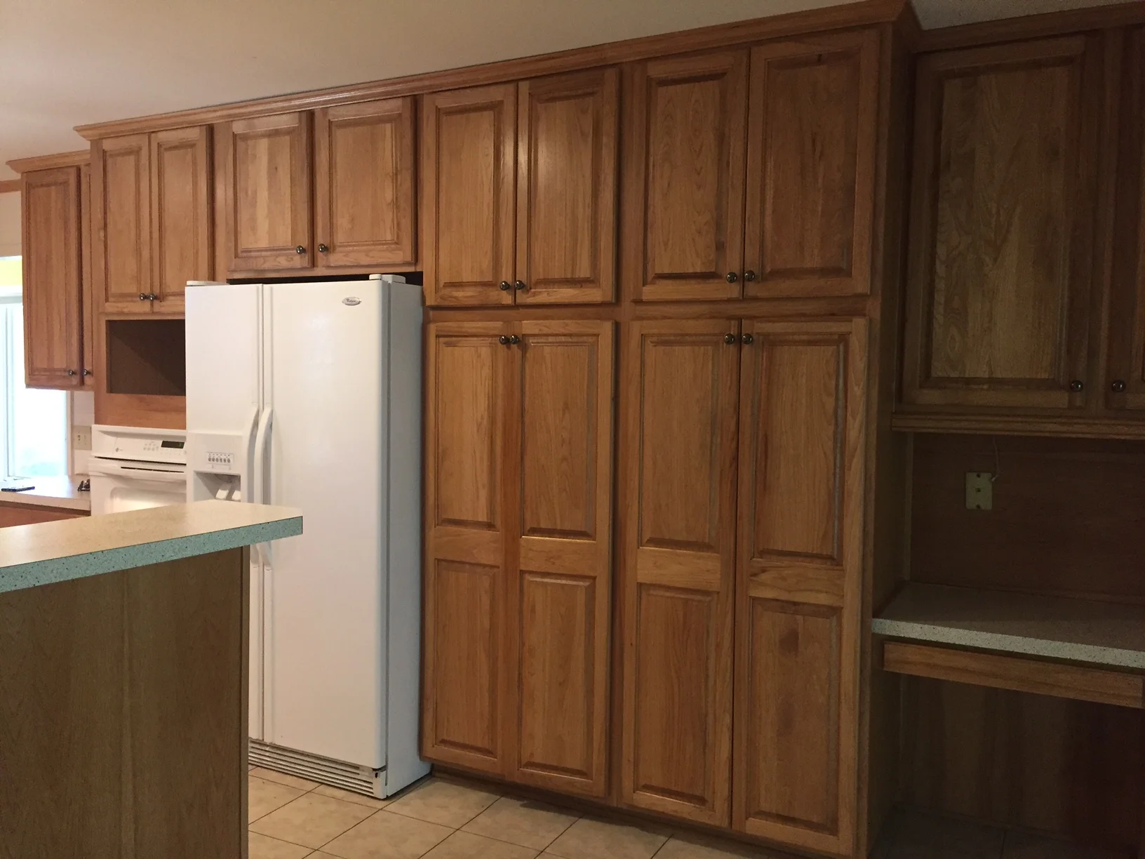
My husband and I knew this was our house the minute we pulled up, before we even set foot inside. We just had that feeling. When we walked in it was full of yellow walls, a mint green bathroom, a lot of wood paneling, light switch plates with brass eagles (not making that up) and an astroturf garage! But I saw the potential and I knew we could make it amazing.
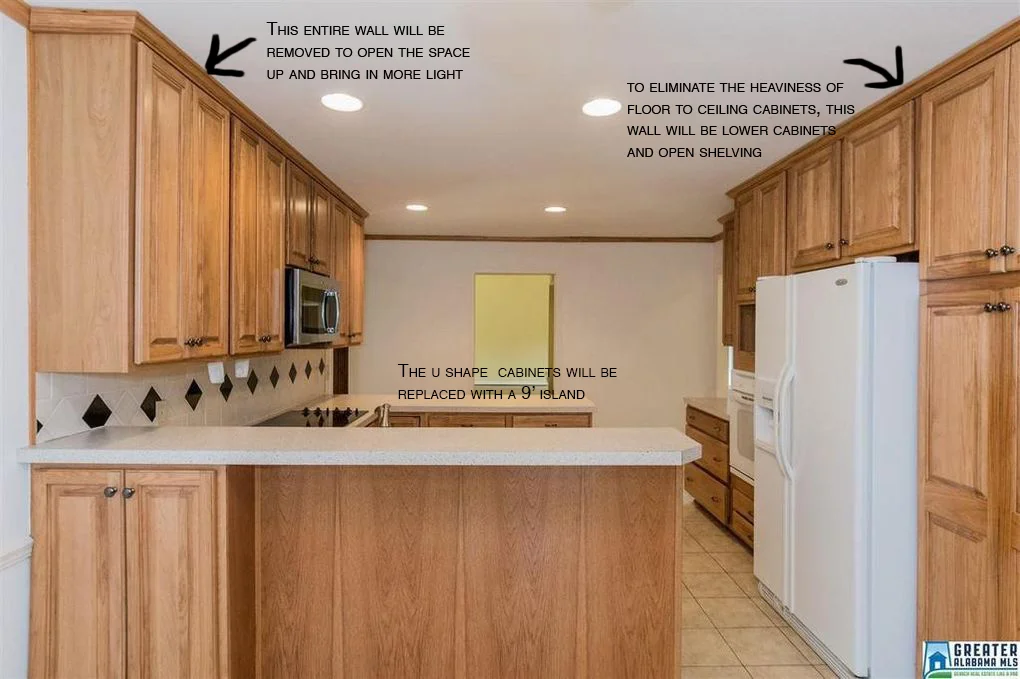
So first, the before kitchen pictures.
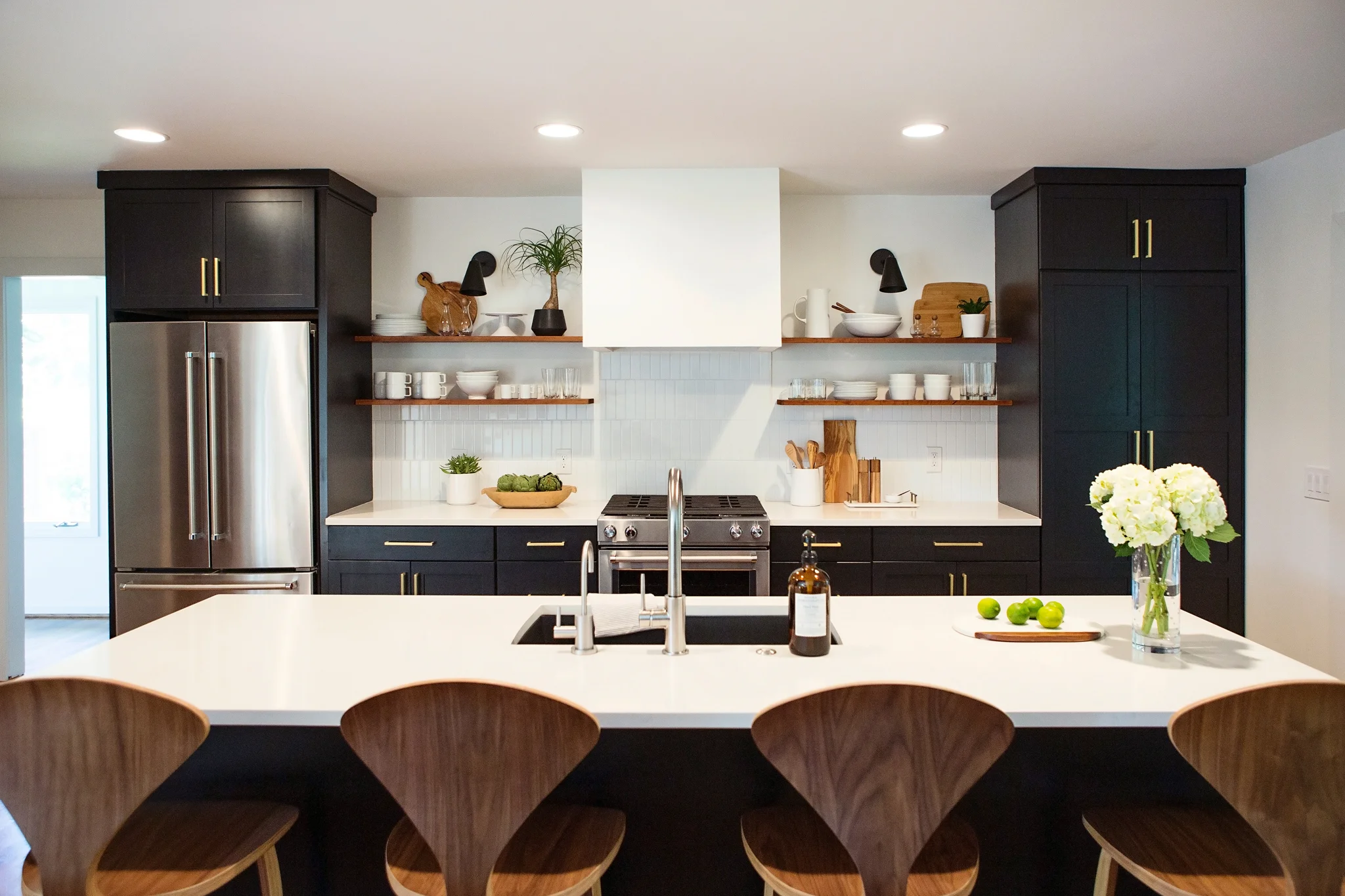
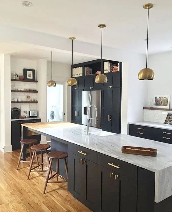
And the after:
I'm still shocked when I look back at the before pictures. I can't believe the change!
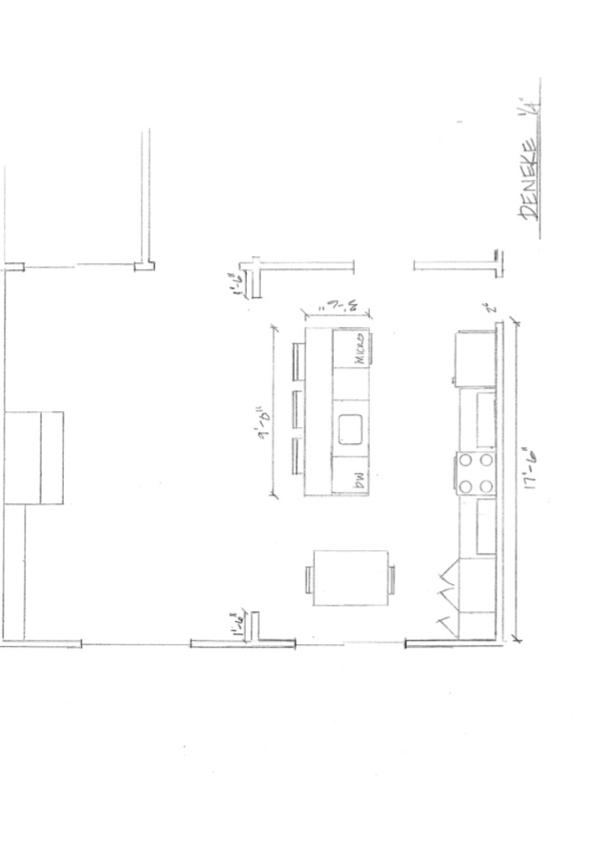
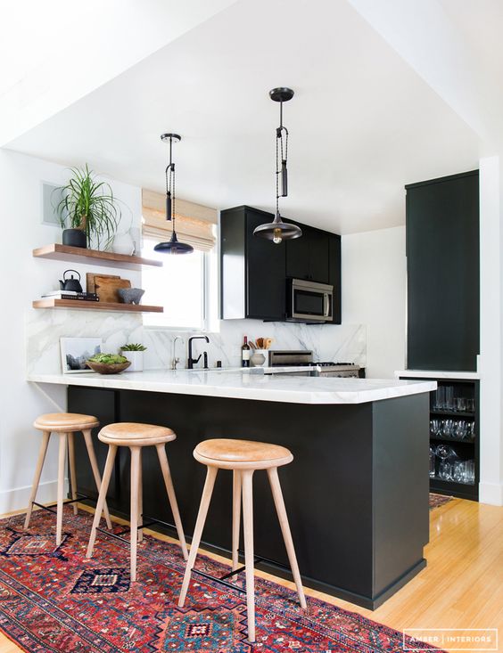
We started by removing that paneled wall between the den and kitchen to open up the space. Taking that wall down brought in so much natural light and made both spaces feel larger. Next, we demoed everything including 6 layers of flooring in the kitchen (no lie) and all the cabinets and appliances. I'm so glad I went with my gut on the black cabinets even though almost everyone told me I was crazy. I LOVE them. And that backsplash - those 2x8 subway tiles are so good! They are still classic, but just different enough from the standard size. And having them Installed in a vertical pattern adds that modern twist that makes me so happy. I had a local company build my open shelves and I love the way they break up the dark cabinets and give me something to constantly re-arrange and style.
You can't tell from the pictures, but the tall cabinets on the right side actually lead to a large walk in pantry. We stole some space from the garage to make that happen, which was my contractors genius idea. Even though it's hidden, its one of the best, most functional features of this kitchen and I'm so glad he thought of it. I plan to take some pictures and post about the pantry at some point.
Check back soon for before & afters of the rest of the house!
Kitchen Sources: General Contractor: Lorino Construction, Cabinets: Brewer Cabinets, Tile: South Cypress, Open Shelving: Barnwood Customs, Hardware: Brandino Brass, Plumbing Fixtures: Fixtures & Finishes, Appliances: Kitchen Aid, Sconces: Cedar & Moss.
After Photos by Ashley Lauren Studios
